
Clarity in Color: Creating HairMD
Background
It was important that we build HairMD in a way that made complex color theory feel clear and approachable without losing its depth. While doing my research, I noticed that most hair focused education either looks overly corporate or is more focused on lifestyle trends than the depth of their content; neither fit the kind of identity HairMD needed to embody. The brand needed to bridge that gap between stylists creative mindset and scientific nature of the topic.
Problem Statement
HairMD is a podcast hosted by color theory educators Melissa and Dustin. It focuses on discussing the science and theory behind hair color; an ambiguous topic within the industry. Each episode brings clarity to a single topic that commonly challenges stylists in their daily salon life. Their philosophy is that while most stylists enter the industry to be creative, true creative problem-solving can only happen when the available tools and principles are fully understood.
Process
Creating HairMD required a multi-faceted approach. Along with building the show’s brand identity, I was also creating the recording studio, filming the content, and handling all editing. To manage the scope, I separated the project into two main tracks: branding and production.
Branding
I started the branding process by looking at how other beauty education brands show up. I found myself feeling like most were either too lifestyle focused and lacked substance or were too focused on using their education as a vehicle to push their corporate agenda. It was clear to me that neither of these approaches would create the
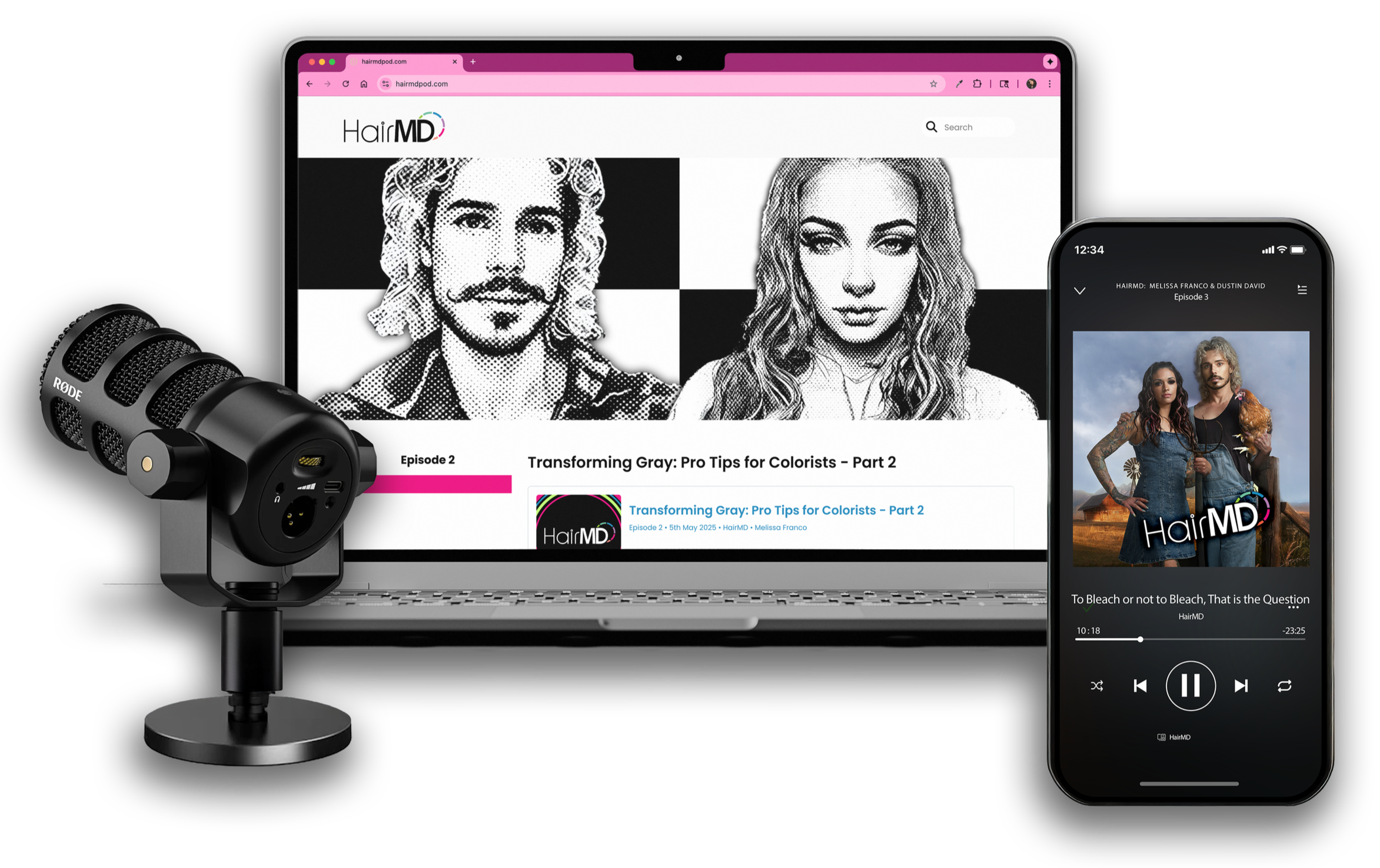
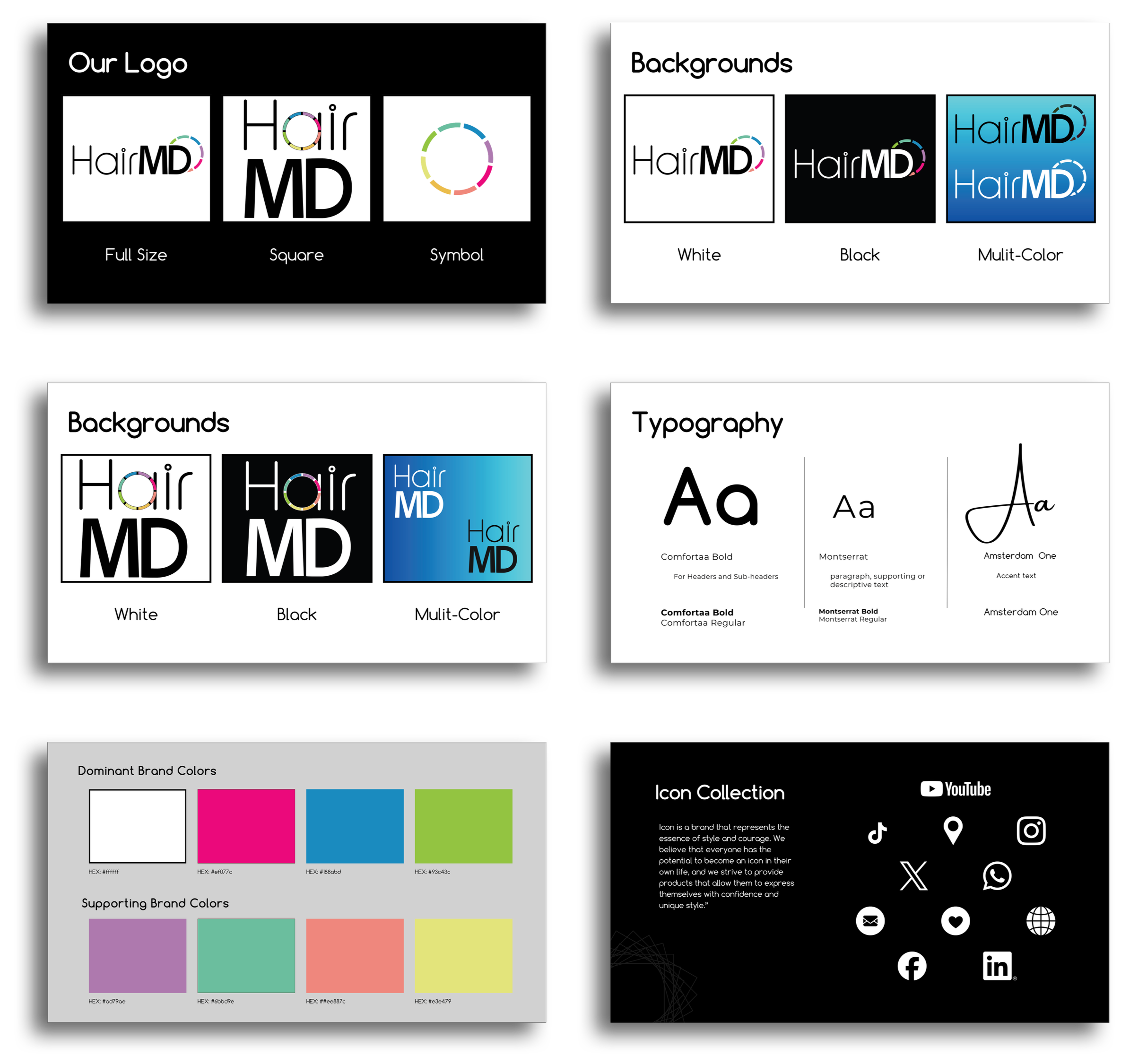
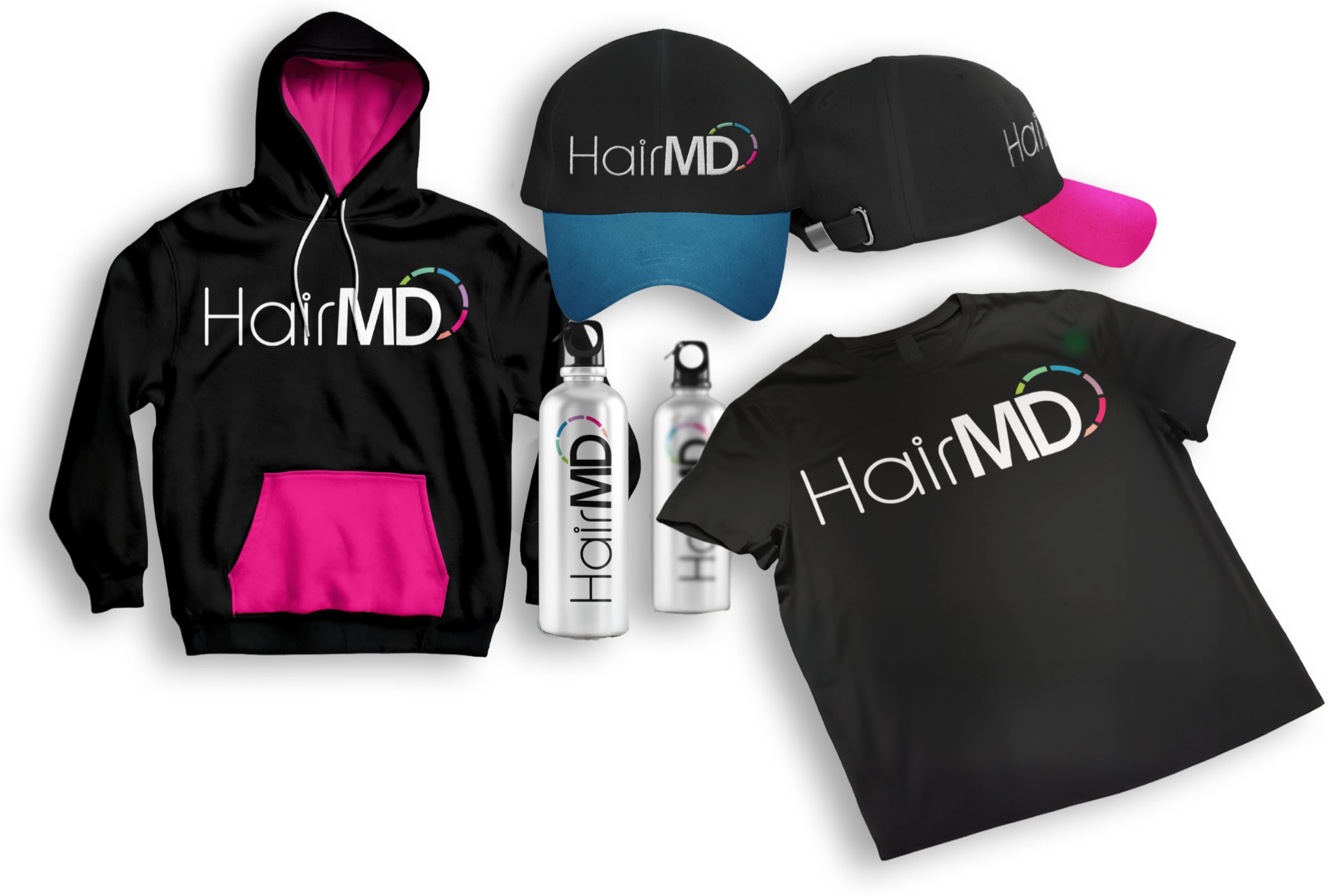
sophistication I was hoping to achieve with HairMD. I built the visual direction around clarity and simplicity. I knew early on that the color wheel would anchor the identity, so it became a key influence while developing the logo. Once that foundation was set, I moved into the rest of the system — cover art, social graphics, and a responsive website — all designed to feel accessible, credible, and modern. The aim was to draw in stylists with compelling visuals and keep their attention through science-based discussions.
Production
Post-production focused on creating a consistent, professional experience across both audio and video platforms. Each episode was edited for clarity and pacing, with audio balanced and cleaned to ensure a polished listening experience. A custom podcast intro was created to establish brand recognition, along with a reusable motion graphic used at the start of each episode to reinforce visual consistency. Color, typography, and timing were intentionally designed so the motion graphic could scale across episodes and social formats, after which final exports were prepared and published for both podcast platforms and digital distribution.
Results
The finished brand gave HairMD a clear identity that stands apart from other beauty education brands—intentionally grounded in science while maintaining a humorous, lighthearted tone: ideal for the professional beauty market. The design provided a strong foundation from launch, helping the podcast feel professional and cohesive, setting the podcast up for success with a system that was built for expansion as it grows.
Extensive research was conducted to plan, design, and purchase the equipment necessary for a functional recording studio. Because video was also required for social content, this need was considered from the beginning of the studio design process. The podcast co-host, Dustin, had available space within his salon, which we chose to use as our recording location.
The room itself was small but acceptable in terms of square footage. However, several physical constraints quickly became apparent. The wall that would have been ideal as a backdrop contained a large mirror, making it unusable for recording. Another wall was occupied by a fixed storage cabinet that could not be moved. Additionally, the space featured mostly hard surfaces, creating significant echo and sound reflection
issues. To address these challenges, we added a shag rug to the floor and installed acoustic panels on the walls to help absorb sound and improve audio quality. For recording, we used a Tascam Mixcast 4 paired with a Limelight microphone, and a Blackmagic ATEM Mini to manage video switching. This setup allowed the active microphone to automatically trigger camera changes, ensuring a dynamic, speaker-focused video experience without the need for manual switching.