Saga V: Where Tarot Meets Taste
Background
SAGA V is a conceptual mocktail brand built around the symbolism of tarot cards and their personas. Each drink represents a card from the Major Arcana, designed to capture the mood, flavor, and emotional theme of its meaning. The concept explores how something rooted in old symbolism can feel modern, minimal, and collectible.

Problem Statement
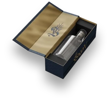
SAGA V was a multi-group collaboration, and I served on the packaging design team, with my primary focus on the structural and visual design of the outer box. The central challenge was to translate the emotional experience of interacting with a tarot deck—curiosity, ritual, discovery, and personalization—into a tactile drinking experience. We needed to create packaging that didn’t simply contain the product, but expanded the narrative behind each mocktail, making the unboxing feel as meaningful as pulling a tarot card and interpreting its message.
Process
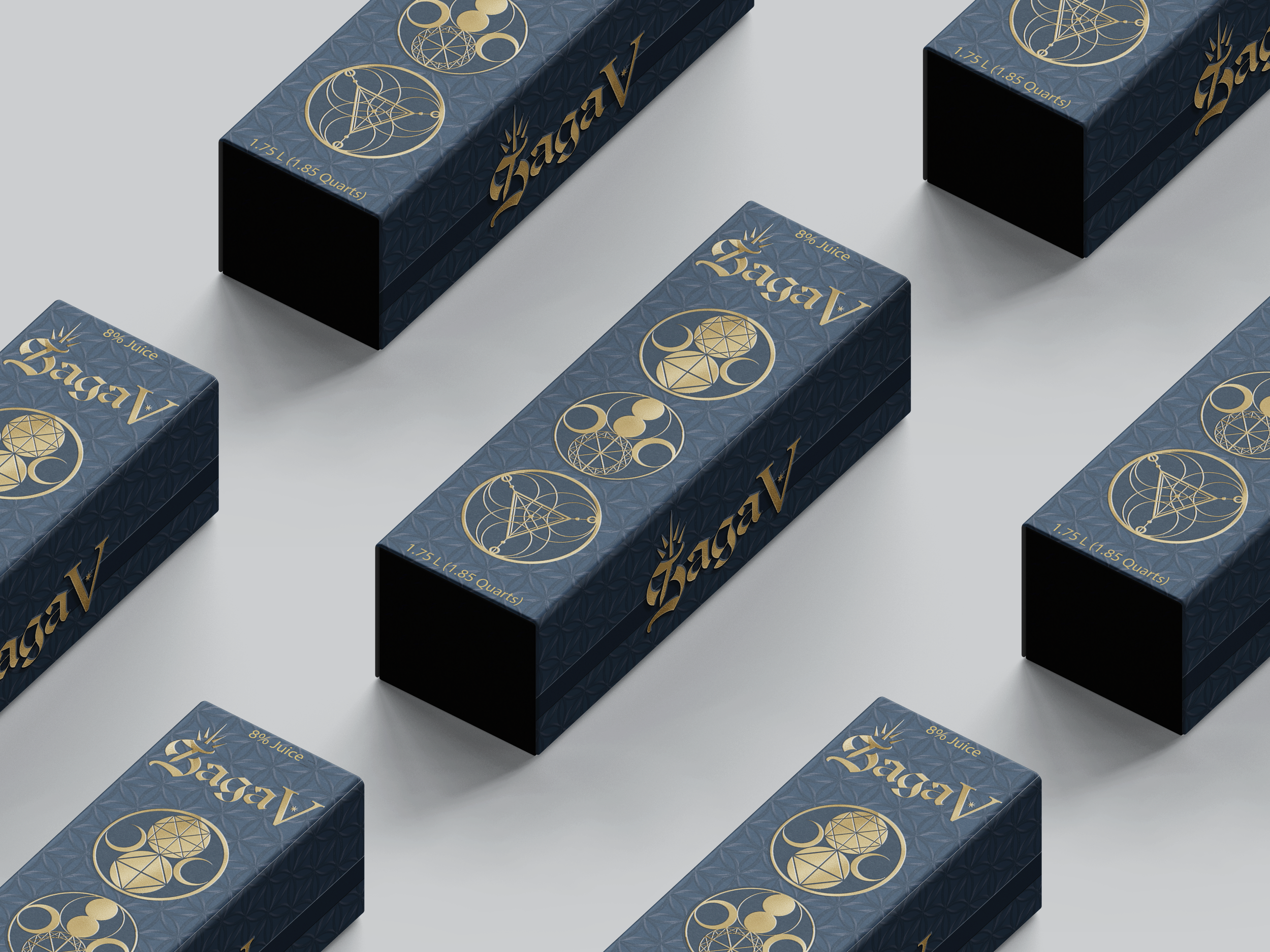
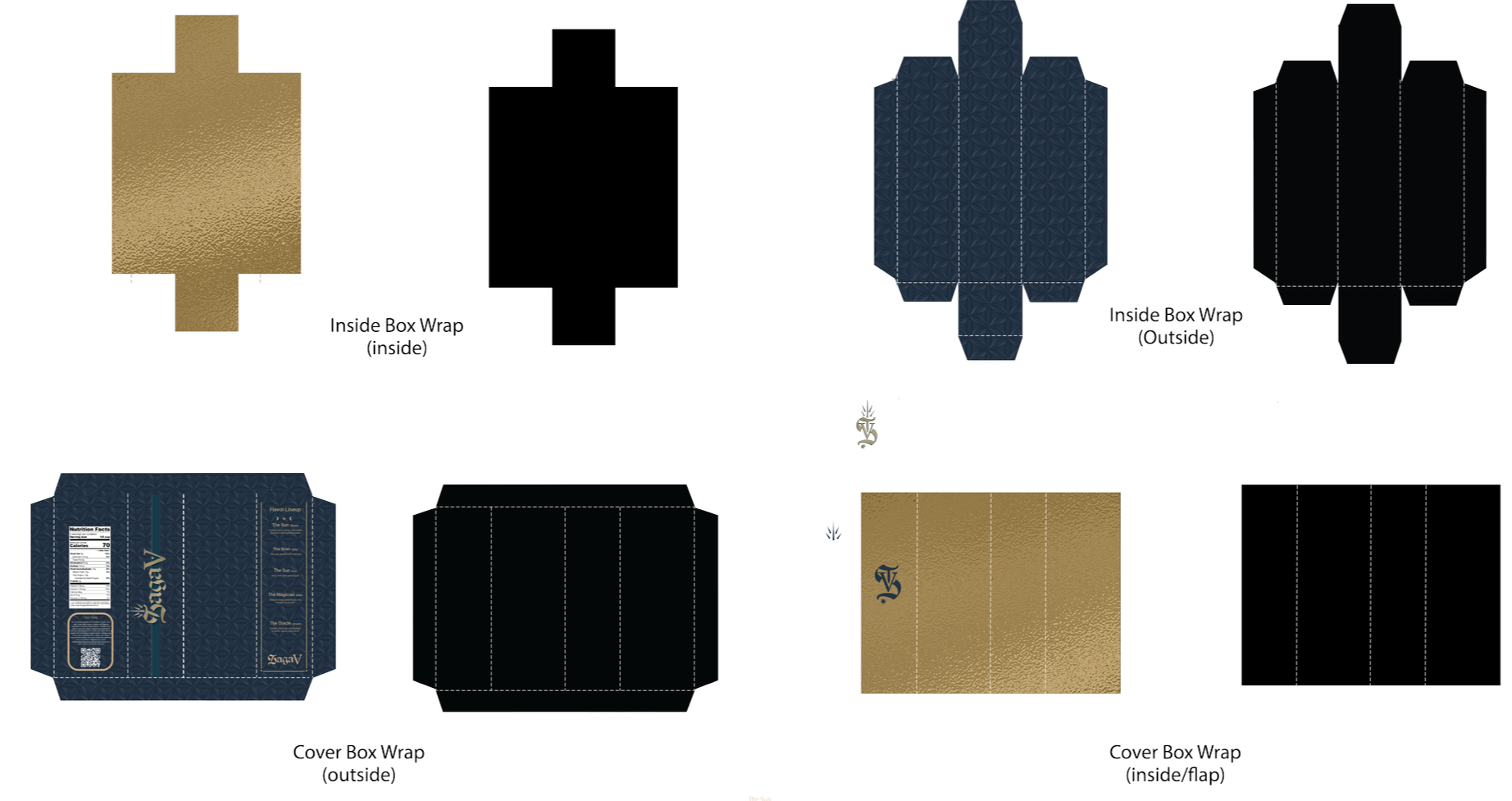
The packaging team was responsible for creating label systems for five unique flavors—each tied to a different tarot persona—as well as one cohesive outer package to bring the full collection together. I led the sub-team focused on the outer box, overseeing both the structural decisions and the visual system applied to it. We anchored the design direction in the idea of a tarot unboxing ritual: the slow reveal, the sense of intention, and the feeling of opening something with symbolic weight.
To achieve this, we evaluated different box styles, closure methods, and proportions, ultimately choosing a structure that felt reminiscent of a tarot deck while still functioning as a premium beverage package. Our visual approach leaned heavily into sacred
geometry. This was the foundation that allowed the packaging to feel mystical without becoming overly ornate. These design staples were applied to both the interior and exterior surfaces to heighten the sense of discovery as the box opened. Every decision, from layout to line weight to color palette, was guided by the goal of aligning the tactile experience with the emotional themes of tarot.
Results
The final outer packaging successfully captured the feeling of intention and ritual that we set out to create. Its structure reinforced the tarot-inspired concept, while the illustrations and color palette created a unified aesthetic that paired seamlessly with the individual flavor labels. The system felt cohesive across the entire line, enhancing both the visual identity and the storytelling behind each drink. The outcome was a refined, luxury presentation that elevated the conceptual nature of SAGA V, making the unboxing feel immersive, meaningful, and fully connected to the brand’s narrative.