Creating Space in a Crowded Market
Background
Kat is an independent stylist renting a chair in a crowded market, so having her own recognizable brand was becoming essential. She needed something clean, consistent, and simple that would help her show up professionally online and in the salon without feeling disconnected from the environment she works in. The brand also needed to match what she’d realistically use on her own when it came time to post on social media.
The challenge was to build a personal brand that felt authentic to Kat—neutral, minimal, and approachable—while working smoothly within the existing salon setting. The system had to be clear and cohesive enough to help her stand out in a saturated market, but flexible and subtle enough that it wouldn’t clash with the current or future space she rents in.
Problem Statement
The challenge was to build a personal brand that felt authentic to Kat—neutral, minimal, and approachable—while working smoothly within the existing salon setting. The system had to be clear and cohesive enough to help her stand out in a saturated market, but flexible and subtle enough that it wouldn’t clash with the current or future space she rents in.
Process
The foundation of this project started with getting to know Kat — not just professionally, but personally. I wanted to understand her preferences, her natural instincts, and how she responds to different aesthetics in her everyday life. I asked her about her likes and, more importantly, her dislikes. I asked her if she were a brand, who she would be, and we talked through why she connected with certain ideas more than others and what those choices revealed about her style. These conversations helped me form a clear understanding of who she is and what her brand should reflect on a deeper, more intuitive level. I also considered the practical side: how Kat would be utilizing her brand on a daily basis, what she needed it to support, and how much time she could realistically dedicate to maintaining it. She’s a busy professional, not a full-time designer, so the system needed to be easy for her to apply on the go without sacrificing consistency, polish, or clarity.
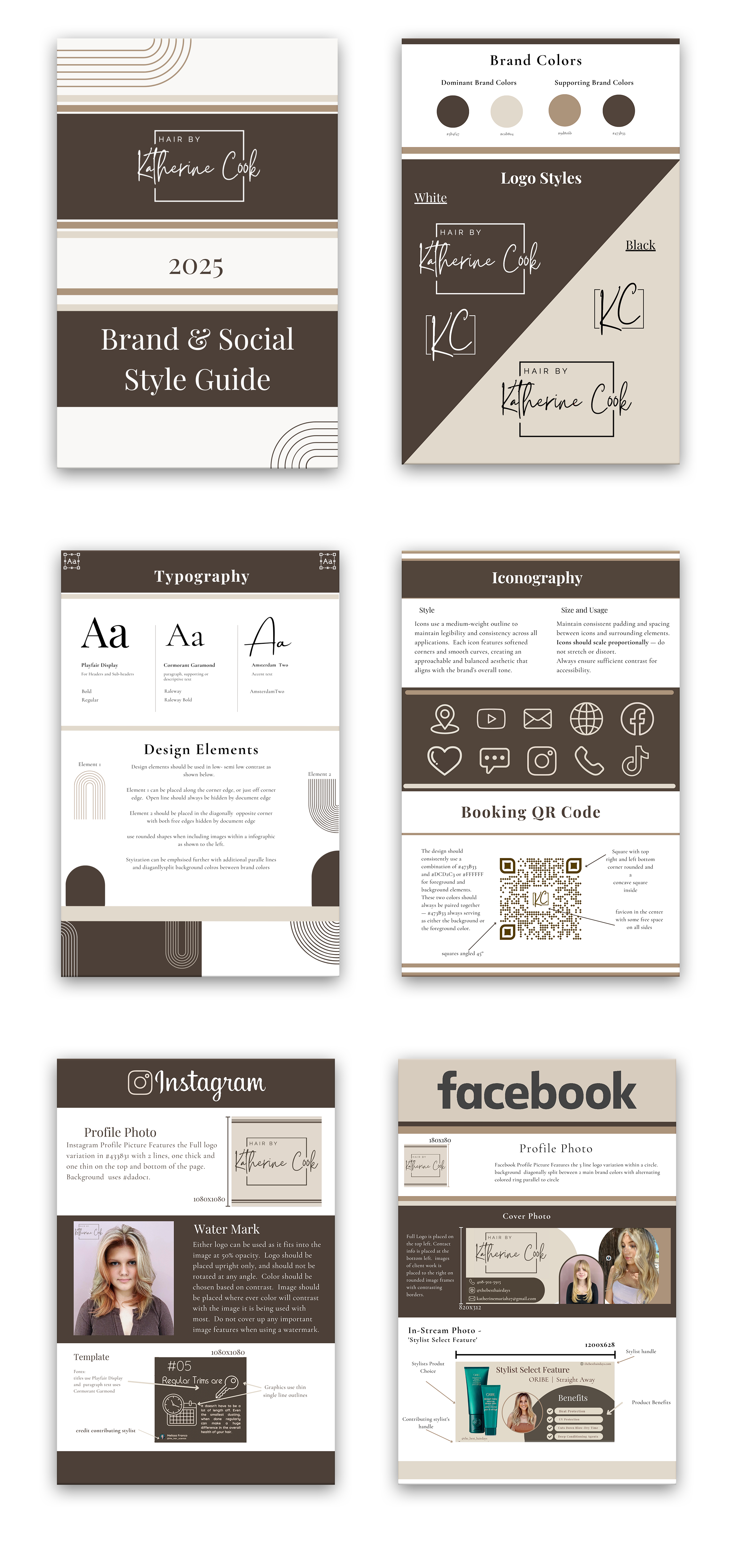
With this information in mind, I established a visual direction that felt authentic: simple, minimal, and versatile. I worked with a palette of cool neutrals that felt calm and modern without being cold or sterile, giving her brand a grounded, understated presence. The typography was chosen for clarity and tone — structured but lightweight, with a quiet confidence that suited her personality and her approach behind the chair. Clean line work and open layouts gave the brand a sense of space and breathability, helping everything feel intentional without becoming overly designed or fussy. Altogether, the visual language matched the professional yet approachable image Kat wanted to present and offered enough flexibility for her to evolve the brand naturally over time.
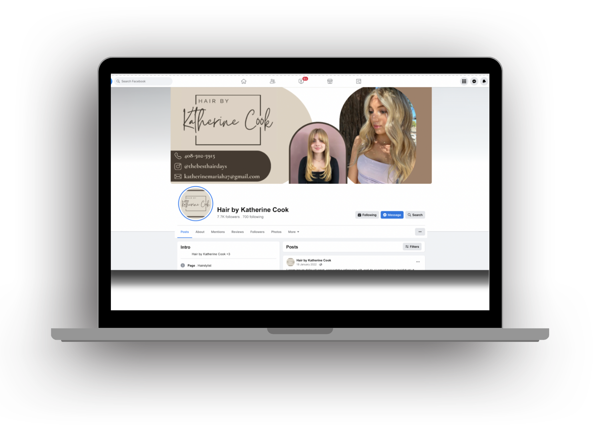
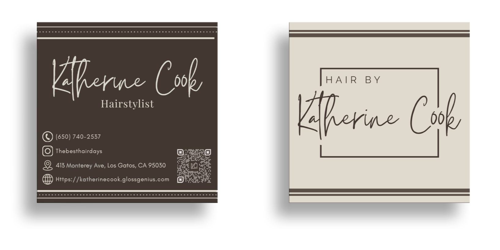
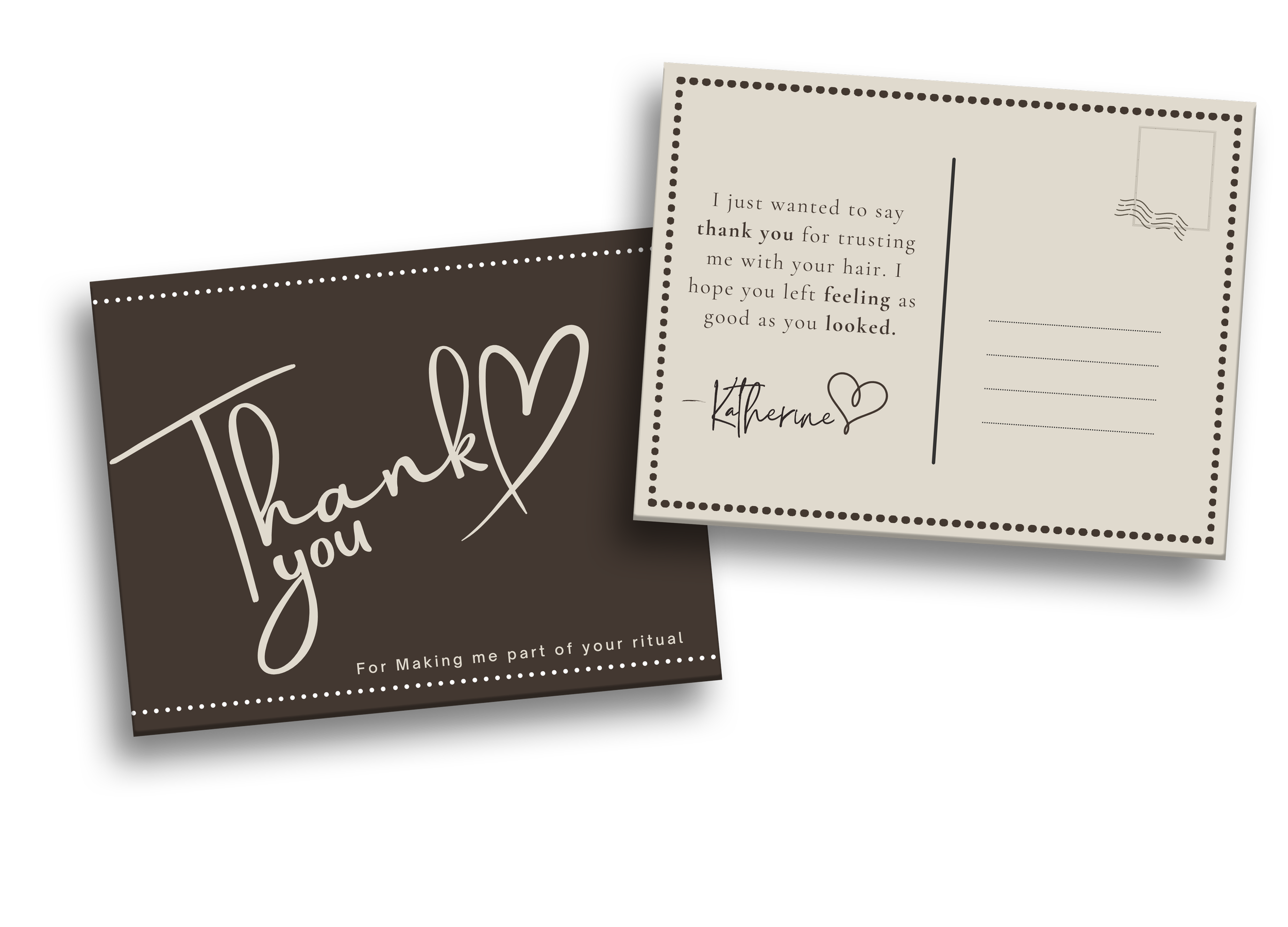
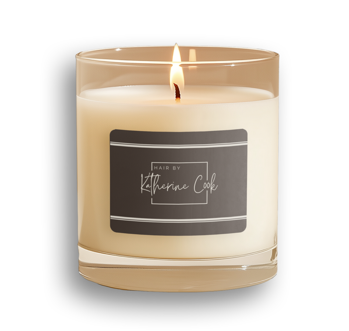
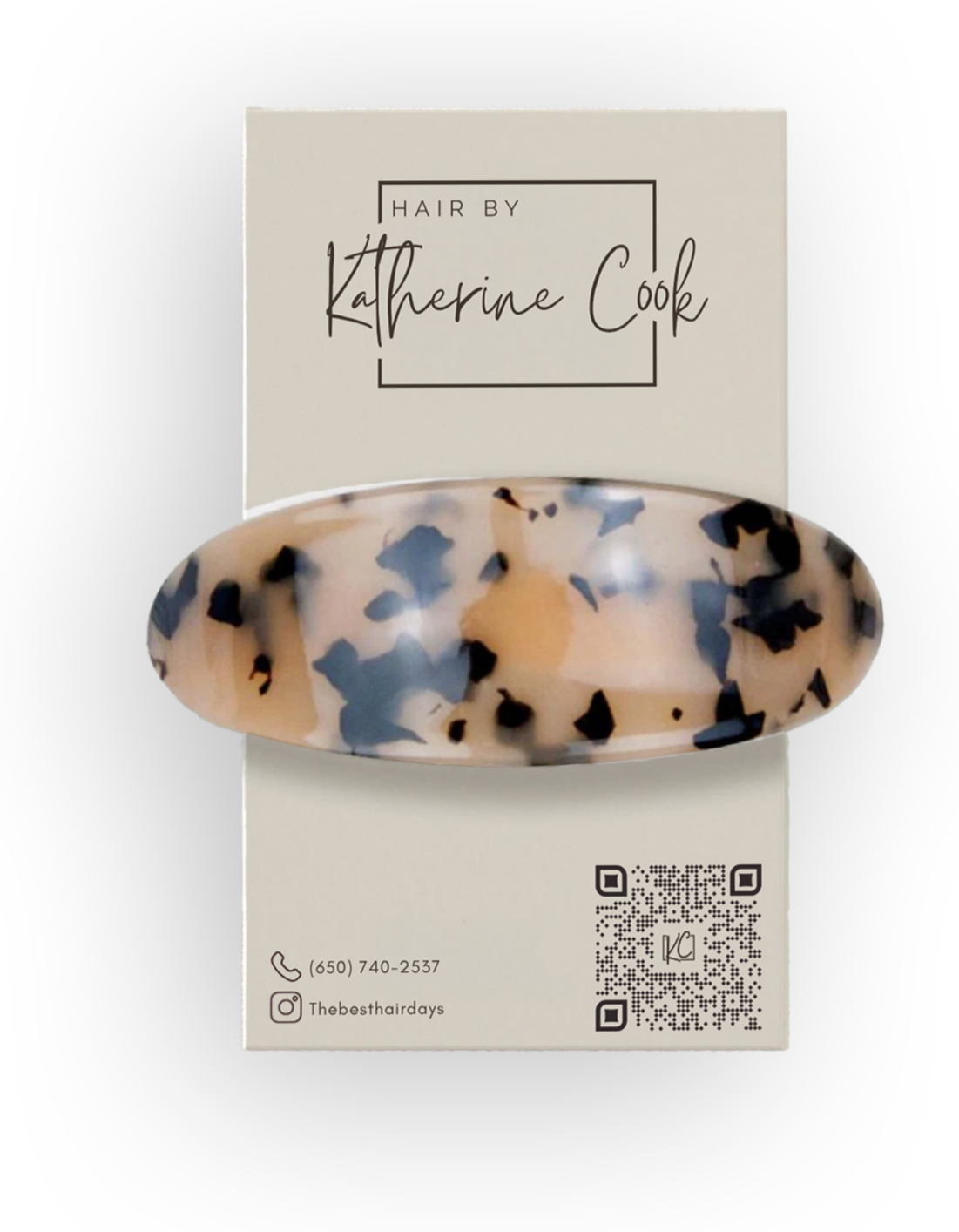
From there, I built a comprehensive system that could grow with her as her business expands. This included multiple logo variations for different use cases, a refined set of type styles, a flexible color palette, reusable social media templates, custom iconography, and a soft watermark system for visual branding across photography and content. I also created print collateral that carried the same sensibility:
polished but minimal, easy for her to reproduce, update, and distribute as needed, while still maintaining a cohesive, elevated identity. The goal was to give her a toolkit that not only looked like her but also supported her work seamlessly, wherever and however she needed to show up.
Results
The final brand captured the balance Katherine naturally brings to her work-refined but easy, modern but not loud. It gave her a visual identity that feels confident without trying to dominate its surroundings, making it versatile enough to live within any salon space. Her branding gives clients a sense of who she is before they ever sit in her chair: professional, approachable, and quietly tren

